skip to main content


Architecture-Design

Austin Maynard Architects: Mills House

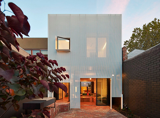
Yes, the Mills House by Austin Maynard Architects does have a cool metal mesh on its rear facade to shade it from the sun. It also has the same mesh running throughout the home, most notably on the stairs and on the floor of the upper level. That’s a neat material to use, as it lets light filter through and the air circulate.
(more…)

Concrete Home of Pedro Reyes and Carla Fernández

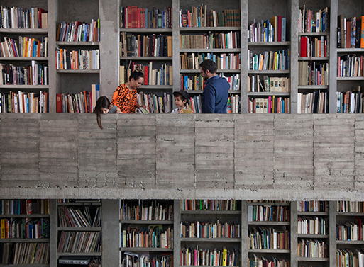
Quite a lot of concrete, isn’t it? The home of Pedro Reyes and Carla Fernández is close to feeling like a castle, with large open spaces and contrasting close corridors. The library is particularly impressive, with its two levels taking up one entire wall of the generously sized living area. See more of the space over at Freunde von Freunden.
(more…)

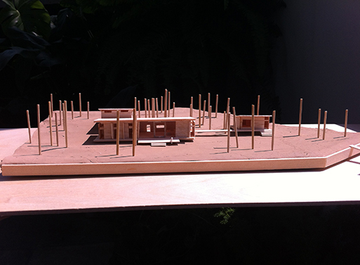
Lake House: Models

For those of you that didn’t read my post on Friday, I’m building a lake house here in Texas. This is an experiment in sharing, as we normally don’t get too personal here on BLTD. However, for such a large project it’d be a shame to not share some of my lessons learned. So, on to the first building stage: concept.
(more…)

Lake House

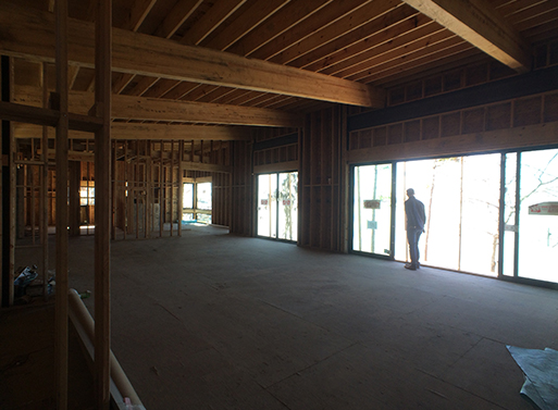
If you’ve ever had the pleasure (and pain) of building a house from the ground up, you know it’s a mixed bag. A great team of architects and builders helps you start out on the right foot, but no matter how experienced that team is- or seems to be- or how much research and preparation you do, there are still going to be issues that crop up.

Those issues, mind you, crop up very often when you build modern/minimal home. Not everyone is familiar with a less-is-more sensibility, and the care and detail required in a minimal, visually clean finish often take twice as long (or more) as as a traditional build. Got an uneven drywall edge? Slap some trim on and no one will know (or care). A perfect, no-trim look on a drywall edge? You’d think you were suggesting a trip to the moon with some contractors. I’ve learned all this in the various remodels I’ve overseen, but especially so in the last year, as I’m currently building a lake house here in Texas.
(more…)
Maison De Gaspé

Before you turn your brain off for the weekend, here’s a little house candy to consider. The Maison De Gaspé by la SHED architecture is oriented around a central family space. As is the trend, an open common area provides a clear view of the kitchen, living, and dining room, and the overall neutral color palette of this space allows a bright pop of red in the staircase to stand out. Maybe you’re not gutsy enough to make such a strong statement with your staircase, but it’s worth considering in a smaller space, maybe with a different semi-vibrant color, to add a little unexpected punch to your home.
(more…)

More information:

View Maison De Gaspé here

Source: Arch Daily

The Vipp Shelter

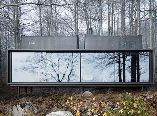
While we’re all still catching up from the holiday break, let’s take a moment to imagine a weekend spent in the Vipp Shelter. Yes, Vipp is a Danish company known mostly for its industrial garbage cans, but now they’ve thrown their hat in the ring for prefab homes. And, once you take a look at their 600-square-foot prototype, you’ll be glad they did.
(more…)

Purchase Information:

Price: $580,000.00
Available from: Vipp

HB6B / Karin Matz

Small, well designed apartments that take advantage of cramped quarters will always have a place in my heart, thanks to living in a ~450 square foot studio apartment in my 20s. I remember imagining countless ways to remodel it if I owned instead of rented. That’s why, despite its somewhat rough looking walls, this little apartment by architect Karin Matz in Stockholm has caught my interest. Take a look at the lofted bed sharing a glass wall with the kitchen, with storage underneath, and marvel at the smart way they’ve incorporated necessary living areas all within under 400 square feet (36 sq meters).
(more…)

More information:

View HB6B / Karin Matz here

Mirror House

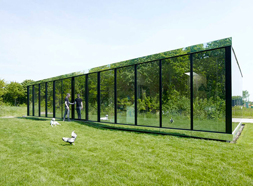
Reflective glass entirely covers the facade of this private villa, providing camouflage and privacy during the day. At night, one can only assume the home lights up like a lamp, but it’s nevertheless notable for its minimal approach and detailed treatment. A compact and simple floorplan allows for an open feel despite the relatively small square footage, and the use of birch multiplex panels throughout the interior contrasts nicely with the shiny, glamorous facade.
(more…)

More information:

View Mirror House here

Source: ArchDaily

Savannah Project

I spy with my little eye two shipping containers. Can you see them? There are two, each one offset with the other with a raised ceiling area in between. It’s more proof that container building can be done well, and there’s no need to sacrifice spaciousness if you keep your roof situation creative. Take a look at the photo below to get an idea of the outside, or visit PSP for more images. The Savannah Project is by artist/architect/designer, Julio Garcia.
(more…)

More information:

View Savannah Project here

Tiny Transforming Apartment

What the what!?! Eight funcional spaces packed into 420 square feet- how is that even possible? Well, turns out when you’ve got clever minds put to the task, a few ingenious solutions will double the storage space. Graham Hill, entrepreneur and treehugger.com founder, is the mastermind of this small-yet-large studio space, and, after you see the video below, you can see more pics (before and after) at Life Edited.
(more…)

Pangal Cabin, EMa Arquitectos

Every once in a while I sneak over to tumblr to get my fix of interior images. Sometimes there’s nothing that catches the eye, but today, thankfully, the Pangal Cabin by EMa Arquitectos popped up on the collective/random radar. At 60 sq. meters (that’s 646 sq ft.), it’s about the size of a studio apartment, yet with the large windows and staggered layout it feels much larger. Of course, having a deck, lap pool, and commanding view of the landscape certainly doesn’t hurt. Located in Casablanca, Chile.
(more…)

Santa Barbara Auto Camp

Remember Matthew Hofmann from the HofArc Airstream Renovation? Well, he’s recently opened an all-Airstream hotel in downtown Santa Barbara, California. Four vintage Airstream trailers from the ’50s to ’70s have all undergone interior renovations- three have completely updated modern interiors and one has been restored to its original splendor with new finishes, systems and appliances. Called the Santa Barbara Auto Camp, each trailer is available for around $120 – $150 per night. More images, background and info from HofArc below.

(more…)

Purchase Information:

Price: $150.00 per night
Available from: Santa Barbara Auto Camp

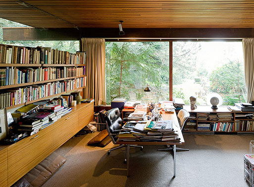
Neutra in Europe

How about some Richard Neutra interiors for your Thursday fix? In 2010, Iwaan Baan documented all of Neutra’s houses in Europe built between 1960-1970, specifically focusing on how each space is being used today.
(more…)

More information:

View Neutra in Europe here

Source: L'Esprit Nouveau

HUS-1

This remarkable cabin on the Swedish West coast is designed by Torsten Ottesjö. With a keen sense of scale, Ottesjö has thoughtfully laid out distinct areas for food prep, eating, and sleeping in 25 square meters. The thinking behind such a project is explained on Ottesjö’s website, with more photos showing the unique curved construction and building details.

(more…)

More information:

View HUS-1 here

Source: iGNANT.de

The Shed by Richard Peters Associates

This 800-square-foot sustainable home in Sydney started out as a humble industrial shed. If you always see potential in old buildings, it’ll probably whet your appetite for your own remodel, so be careful.
(more…)