skip to main content


Architecture-Design

strata arkitektur (naturreservat)

Wow…if this is indeed a forest superintendent’s cabin, I might rethink my day job.

Jordivayreda- Staircases

Here’s a couple of interesting staircases by Jordivayreda Project Team.

[via Blue Ant Studio]

Casa Dejardin Hendric

I don’t know anything about this home other than it’s super modern and simple. Especially interesting to see the assembly/building photos…and take a look at the staircase- it’s one whole unit (you can see it in the pre-paint stage in the assembly photos).

Update: Thanks Katelijne for emailing a link to Belgian architect Pierre Hebbelinck’s site where there are more photos and information.

[via notcot]

Woo Loft, New York

I saw this quite a while back in dwell magazine (as I’m sure some of you did too) and it remains one of the more ingenious solutions for a sleeping area in small spaces.

“Having decided to site the new loft bedroom directly above the kitchen, the architects met the challenge of stacking two rooms, each with a seven-foot ceiling height, in only 12 feet of vertical space by creating two interlocking puzzle pieces: The mattress in the bedroom sits directly atop the ultra-thin kitchen ceiling (which enables a full-height space downstairs), and the floor area around the mattress is two feet lower than the platform on which it sits (thereby creating a full-height circulation area up above).”

[via dwell.com]

Klein Bottle House

This is a crazy house, and I mean that in a good way. The whole black/cream/red/orange color palette is so very suitable to the sharp angles, and I think it’s pretty fascinating how the idea of the Klein Bottle was the base from which the structure evolved.

“This holiday house is situated on the Mornington Peninsula 1.5 hrs drive from Melbourne. It is located within the teeโ€“tree on the sand dunes, a short distance from the wild 16th beach. From the outset MCR wanted a building that nestled within the tree line. That talked about journey and the playfulness of holiday time. What began as a spiral or shell like building developed into a more complex spiral, the Klein bottle. MCR were keen to be topologically true to the Klein bottle but it had to function as a home. We thought an origami version of the bottle would be achievable and hold some ironic fascination.”

[text and images via materialicio.us]

decor8 ‘rooms I *heart*’

If you’ve not visited decor8, just a warning: the collection of room photos she has on flickr is completely addictive.

Sunset Cabin by Taylor_Smith Architects

Of course the fascination with smaller homes and get-aways continues, mostly due to architects creating cabins just like this. The first sentence quoted below leaves me terribly excited about the future.

“It is a one-room (190 square feet in size), self-contained box that was built by furniture craftsmen in four weeks in a Toronto parking lot and installed on site in 10 days.
Three of the exterior walls are floor-to-ceiling glass and of those, two are encased in horizontal cedar-screens for privacy, shade and light effects inside. One of the cedar screens has a large opening providing a direct view of the sunset from the built-in bed. The rest of the screen has random smaller gaps to allow various vignettes of the surrounding nature and to create fantastic light patterns inside. The slats are positioned so that there is no direct view in from the outside, but at the same time, it the inside feels almost wall-less.”

[image and quoted text via thecoolhunter]

Room Planner

One of our readers, Ryan, dropped us an email to let us know about this online room planner. It’s pretty easy to use and can get kind of addictive if you’re into rearranging furniture, but it will save you tons of backbreaking time moving around heavy sofas and cabinets.

Thanks Ryan!

More information:

View Room Planner here

Sayama Flats by Schemata Architecture Office

Looking through Dezeen I came across the
Sayama Flats by Schemata Architecture Office. Seeing these photos prompt the discussion of what’s actually necessary to renovate. With the influx of new products, we’re all probably guilty in some way or another of consumerism, itching to rip out the old-but-perfectly-functional sink so that the shiny new one can take its place.

I’ll be the first to admit I constantly want to remake my own home, but there’s something about these photos that pull charm from some decidedly not-cool kitchen units, and I suppose it’s more about a space in flux and the possibilities that exist…whatever it is, it works for me. The super shiny polished floors don’t hurt either. (And, what the heck is up that light fixture over the bed? I want to know who makes it and how much it is.)

“The architects, headed by Jo Nagasaka, partially stripped the flats back to their concrete shell, altering selected elements such as windows, doorways and partitions while leaving some parts such as the kitchen units untouched.” –Dezeen

โ€œIn general, Japanese renovation projects are started from removing every old interior and then redesigned it. However, in this project we started to choose what is necessary and what is not from an existing interior space. Because of remaining some of the elements of the interior, we achieved to design a neutral space that motivates young people to create their own life-style.โ€ย-Nagasaka (via Dezeen)

[posted by katie]

Parabola House

In Dezeen’s latest newsletter they featured the Parabola House designed by Atelier Tekuto (funny enough, I had just been at their site yesterday, but hadn’t seen this particular gem). How the light filters through the space given the restrictions of privacy is surprising, and holy, that staircase is lovely.

More pictures at Dezeen.

Clipping Corner House

I’ll be the first to admit I’m slightly addicted to browsing through pictures of recent Japanese architecture. I’m continually amazed at the simplicity.

The Brain ‘laboratory’

I saw a small picture of the main room shot from inside a while back when doing a post on the book ‘Tom Kundig: Houses’, so I’m thrilled to come across the structure shown in full glory. I’d sure love a box like this to think in…

“The Brain is a 14,280 cubic-foot cinematic laboratory where the client, a filmmaker, can work out ideas. Physically, that neighborhood birthplace of invention, the garage, provides the conceptual model. The form is essentially a cast-in-place concrete box, intended to be a strong yet neutral background that provides complete flexibility to adapt the space at will. Inserted into the box along the north wall is a steel mezzanine. All interior structures are made using raw, hot-rolled steel sheets.”-olsonundberg.com

[posted by katie]

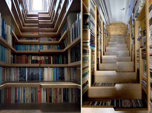
Library Staircase

This is the smartest staircase ever. (The picture on the left is looking up, the one on the right is looking down- just in case it’s confusing)

via apartmenttherapy.com:
“Limited by space, we melded the idea of a staircase with our client’s desire for a
library to form a ‘library staircase’ in which English oak stair treads
and shelves are both completely lined with books.”- Tim Sloan, Levitate Architects

Source: Via

Private Library

This studio/library designed by Andrew Berman Architect is a perfect small space that utilizes structure to provide both privacy and light without sacrificing views of the surrounding trees.

[via notcot]

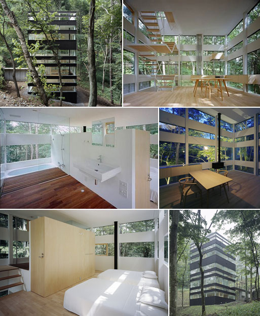
Ring House, Karuizawa by TNA

Recently saw this weekend home on Wallpaper– it looks amazing.

Architects: Makoto Takei and Chie Nabeshima (TNA)

[via Wallpaper Awards ’08, Best New Private House.]