skip to main content


Inspiration

Art Gallery Inspiration

Finding inspiration for a specific project can take up tons of time, especially as it’s easy to get sucked into the vortex of Tumblr, Pinterest, etc. I recently have been rethinking hanging some existing art in a new random way, and just in case you were too, here are some of the images I’ve bookmarked as favorites. (Most of the images we’ve bookmarked via Tumblr have unlisted sources, which is a shame, but luckily some are linked correctly. If you know more info, please comment and/or email us and we’ll add it in.)
(more…)

Kitchen Remodel

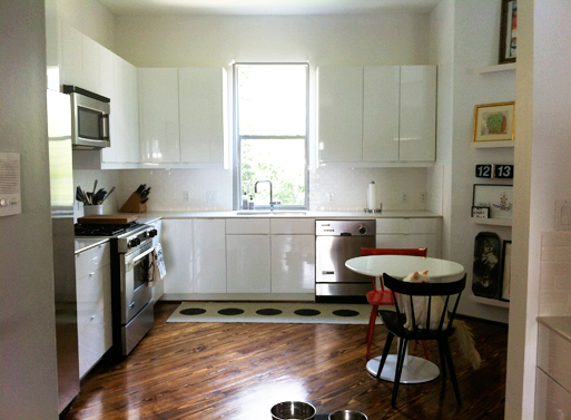
If you’ve never completed a kitchen remodel, you and I had something in common 7 weeks ago. Fast forward to last week, to my mostly new kitchen (shown above) which sports white shiny cabinets, an almost white Silestone countertop and an off white porcelain backsplash. White, white, white. If you’re curious as to how the project progressed, you’ll find more pictures and commentary below.

(more…)

MAKE Architecture Detached Home Office

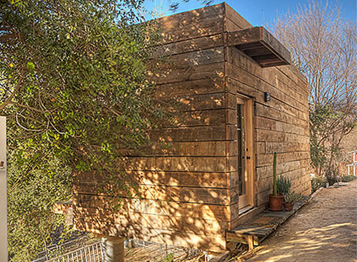
I was perusing MAKE’s portfolio site and came across this exterior home office done for Actor Rainn Wilson. It’s 200 square feet and the exterior is clad in reclaimed lumber.

“Featured on the DIY Network’s “Man Caves”, MAKE work with their production team to produce a detached home office for renowned actor Rainn Wilson from The Office. Perched on the crest of a slope and overlooking the actor’s stable, the office space was conceived as a tree house with views through the generous glazed facade at level with the surrounding tree canopies.”

(more…)

Kitka Office Remodel

There’s a great, inexpensive office remodel over at Kitka in which they use super shiny plywood floors and a black and white color scheme that looks pretty fantastic.

(more…)

More information:

View Kitka Office Remodel here

Pool House Backsplash

I usually use our tumblr account to bookmark interior images, and because we’ve been crazy busy with the site remodel, I’ve been a bit remiss about occasionally posting some of the ones that stand out the most. Today I finally got a chance to go through some of my rss feeds, and found this image over at kbculture. I think it’s a pretty perfect example of how minimal design can have interest and warmth with the right use of materials- in this case, with the green glass backsplash and the wood accents. To see more, take a look at the Pool House via Retrouvious.

Source: kbculture

Lyndsay and Fitzhugh’s Brooklyn Home

Lovely, isn’t it? Kudos to Lyndsay and Fitzhugh for making such a light and bright space. If you’ve got the time, take a look at their home through Todd Selby’s lens. There’s some great shots of vignettes and such.

design in a bag

Overwhelmed by where to start on your kitchen or bath remodel? Design in a bag has various bags or ‘recipes’ of color and material groupings along with price and resource listings that takes the guesswork out of the equation.

Purchase Information:

Price: $69.00
Availability: Buy design in a bag here

Inspiration: Fitzroy Apartment

It’s not often that you see green done well as an overall color theme, but this room styled by Simon Carver has me hooked. The softness of hue is complemented by the black/white/natural accents and would be an excellent choice for a bedroom, as it seems to absorb just the right amount of light.

Scenography Apartment

A change in color is part of what keeps things fresh. It’s a technique that designers in most fields use (you’ll see it at work everywhere from The Gap to IKEA) and it was the idea behind the color-changing lights in AA Studio’s Scenography Apartment. AA Studio is known for their contemporary, thought-out, and constructed interiors and the color-changing lights help to continually re-invent and re-define what could be an otherwise stark space.

Continue reading for shots of the apartment in its technicolor glory and for shots from IKEA’s new color campaign, because it’s so cool and makes so much sense.
(more…)

Source: Yatzer

OWI: American Outfitters

These two photos of a 70’s villa are uber-minimal/sparse, but the other shots show a quirky side. Refurbished by interior architects Renaud De Poorter and Femke Holdrinet, the home still has the bones of the original build, but the updates make it feel thoroughly modern and livable. It’s quite the showpiece.

Photography: Verne

(more…)

Source: OWI

Inspiration: Ranjana and Naeem Khan’s Soho loft

There’s quite a few fetching things about this living area in Ranjana and Naeem Khan’s Soho loft, the least of which is the (still) lovely Pouf Capitonne that we’ve featured before. Considering the super-wide/super-low green sofa and the many modern classics (see below), it’s sort of surprising to see the peach/rose undertones in the curtains and carpet. Talk about a color that most of us wouldn’t think of, peach is it. Just goes to prove that sometimes unlikely color combinations work well, so widen your color horizons the next time you’re considering updating a room.

Product links and more photos to follow.
(more…)

Inspiration: Orange Office area

This isn’t the best quality picture, but it does serve to remind us that orange can be good… sometimes. Also, it’s worth noting that this under-the-stairs desk manages to pack a lot of work surface into an otherwise underused area.

Inspiration: Stair Materials

I’ve had these two images in my inspiration folder for a while now. The mirrored stairs shown on the left is from photographer Polly Wrenford’s portfolio, but I didn’t have much luck with referencing the one on the right. If you have info, please let me know.

Feld’s Kitchen

Well, this sort of idea for kitchen storage would certainly motivate you to keep your shelves tidy. The balance of industrial and natural materials (wood, marble, etc.) makes for a pleasing picture, I’m just wondering about those sliding panels. Would they get in the way, or just act as strategic screening for the untidy areas?

See Dwell for complete slideshow.

More information:

View Feld’s Kitchen here

Source: Dwell

Cottier/Barber Home

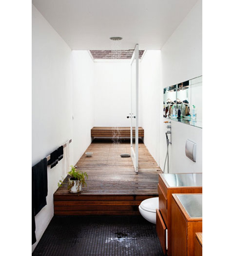
Take a look at this gem of a bathroom. The wood floor of the shower extends into the outside patio, and with that huge pivoting door, the indoor/outdoor divide is blurred nicely.

(Here’s a previous post on pivoting doors, with these two resources listed for hinges:
ePivots and Rixson)

More information:

View Cottier/Barber Home here

Source: The Selby