skip to main content


Bathrooms

Cottier/Barber Home

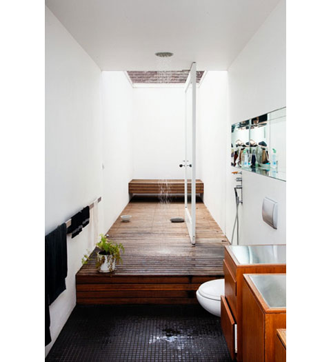
Take a look at this gem of a bathroom. The wood floor of the shower extends into the outside patio, and with that huge pivoting door, the indoor/outdoor divide is blurred nicely.

(Here’s a previous post on pivoting doors, with these two resources listed for hinges:
ePivots and Rixson)

More information:

View Cottier/Barber Home here

Source: The Selby

HOUSE MILCAMPS

Yes, these two photos are of the same house. Does that blow your mind, because it sure did mine. If you want your head to properly and majestically explode, take a look at the following photos. Freaking A-maz-ing.

All photos, Tim Van De Velde.

(more…)

More information:

View HOUSE MILCAMPS here

Source: OWI

Inspiration: Small Tile Everywhere

Here’s a small grouping of bathroom photos with aqua/blue small tile used (almost) everywhere. I love the way it looks, but would you get tired of all that color after a while?

top left: AT: Kimberly’s Loft
top right: Scott Weston Archtecture*Design
bottom left: Scott Weston Archtecture*Design
bottom right: Beach Studios

Inspiration: Bathroom (Showdown)

I’m planning on updating our bathroom once we eventually move back to the US, and so far these two photos top the list of my starting reference point. I’ve always like the penny tile (especially dark like on the left) but there’s something incredibly clean and refreshing about all white bathrooms. Hmm, which direction to go…

Cutler Townhouse Bathroom

In the Cutler Townhouse by Murdock Young Architects there seems to be a rug on the wall. At first, I had a distinct ‘ew’ response, but after looking at it for a little while, it seems to be growing on me. Maybe the green texture has more of a living wall look? Whether you like rug-on-a-wall idea or not, the application of such a distinct texture on a smaller area certainly adds a lot of interest, so it’s something to think about if you want to kick up your space a notch.

See it here.

Villa Berkel

This home has a very Farnsworth House/Mies Van Der Rohe sort of feel to it, with the exterior walls all being glass and with a central core. One difference however, is that in the Farnsworth house, the bathrooms are in the central core, and this fabulous bathroom is out there for everyone to see.

[posted by kris]

More information:

View Villa Berkel here

Source: Via

Bathroom Inspiration at Door 16

If you’ve been following the remodel section, you know that I’m currently remodeling an old home. Due to budget constraints, that means lots of waiting and obsessing on the internet trying to find solutions. Ordinarily, I would know exactly how to do the remodel, but in this case, my home is an old California Craftsman, and I’m not really sure how to honor the old structure while updating it. Basically, I don’t have enough experience with the style to know how to proceed.

One salvation for me has been Door 16. While her home is a Victorian and the styles are somewhat different, some of the updates she is doing would actually work quite well in a Craftsman.

These are some bathrooms she posted late last year for inspiration and I’m thinking these style might work in my home.

[posted by kris]
Heath 2×12 Tiles

This smattering of 2×12 shiny tiles with the matte green is lovely.

Photo: Clear Creek Spa by Merideth Boswell in Meadow Green, Jade Green and Seafoam using 2×12 tiles.

More information:

View Heath 2×12 Tiles here

Durat Sustainable Tubs and Sinks

Durat makes solid surface sinks, tubs and shower trays from 50% recycled content which is 100% recyclable.

Comes in 64 colors.