skip to main content


Materials

Inspiration: Stair Materials

I’ve had these two images in my inspiration folder for a while now. The mirrored stairs shown on the left is from photographer Polly Wrenford’s portfolio, but I didn’t have much luck with referencing the one on the right. If you have info, please let me know.

Inspiration- Stairs with Glass Banister

Hmm… concrete plus glass usually means cold (not brrr-cold, more like cold-museum-looking), but this stairway/entrance (garage?) has been in my inspiration files for a while. Knocking down a regular banister in favor of a glass one *wall* like this would sure let a lot more light bounce around, not to mention pare down any visual clutter. Of course, the artwork, bike, and chair helps this space to feel lived in… it might veer towards the uncomfortable-museum-look without them.

Image from Aun and Su-Lyn’s home on Design*Sponge.

*Thanks Joe

Source: AT

Oktavilla / Elding Oscarson

Magazines as wall material! Such a great idea. Check out the rest of the project via ArchDaily.

“Besides having a literal relevance to the clientโ€™s business, the wall made of stacked bundles of magazines is not only a natural conversation piece in its mere irrationality, but also works as an acoustical absorbent.” -ArchDaily

Architect: Elding Oscarson

House 43, photos Dujardin Filip

OWI is a treasure trove of homes to break my heart against, I swear. This strange one has all sorts of odd choices, but the end result is honest and comfortable. Things to pay attention to: the unassuming facade, the atrium with retractable roof (of course), the staircase through the brick wall and the small glass floor portion below (shown lower right), huge metal bookcases filled to the brim, the lack of ‘finish’ to the ceilings, and about ten other things that I won’t list. It’s like a person you meet that seems sort of boring until you discover they are absolutely fascinating.

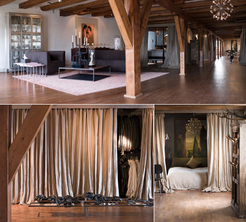
Amsterdam Sugar Warehouse

Not that original sugar warehouses are a dime a dozen, but this open plan space might be easy to replicate given a few splurges. The owners of this particular loft have used beige (or natural?) linen curtains throughout to separate areas and, surprisingly, it seems to work well with the original beams and floors. Curtains can look a little fussy at times, but given that the fabric and color is consistent in this case, they look functional and appropriate to the decor.

[via LoftLife Magazine]

Source: Via