skip to main content


RENOVATE

Ceiling Medallions

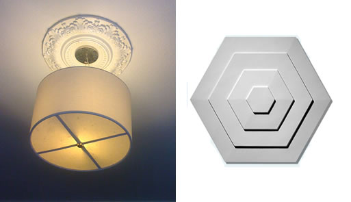
I’m a big fan of the juxtaposition between old and new, and as such I’ve been considering a ceiling medallion for my home. I was thinking I could go with an old medallion with a new lighting fixture as seen on the left, or go with an entirely modern medallion, as seen on the right.

What I really like about the photo on the left is that the light fixture is exactly the same size as the medallion so they really create a nice effect. This photo was taken from a house I used to live in–the medallion came with the house, and the lighting fixture was about $20 from Target (no longer available). You can find a nice selection of medallions online, such as at Lamps Plus or CeilingMedallions.com.

The modern medallion is available here for $69.

More information:

View Ceiling Medallions here
Bocci 22 Outlets

I’m a little amazed I haven’t posted these before, as it was one the best things at the 2007 ICFF. What’s incredibly frustrating is I remember finding a direct retailer some time ago, but now I can’t remember where…if you know, please include link in comments or email me.

The 22 is a complete suite of electrical wall accessories that challenges the traditional, tired and ubiquitous cover plate concept. Power receptacles, lighting control dimmer switches, on/off switches, telephone and data connections, cable and speaker outlets, etc. may now be mounted flush into drywall or millwork with a new CSA approved utility system that eliminates the need for a cover plate. Switches and power receptacles can now be flush with the surface of the wall and be significantly more visually subtle than ever before.

visit Bocci website.
See Creede’s (from Grassroots Modern) pics of installation here.
[via Unplggd.com]

approximately $16.00 each single outlet, $40.00 removal tool, Buy it here.

More information:

View Bocci 22 Outlets here

London Urchin’s Fold-Out Jewel Box

300 square feet seems incredibly small, but the way this tiny studio is arranged it seems three times as big. The kitchen is especially notable, as doors unfold to reveal hidden compartments and storage space, as well as a sliding counter that extends for food preparation. The bright blue on the interior kitchen area is an incredibly smart touch, as it adds to the whole jewelry box concept.

“My studio has been transformed into a flexible living space which allows me to work, sleep, eat, and relax within the confines of 300 square feet…The concept of a jewelry box has been expanded so that the space can be transformed through pushing, pulling, sliding, opening and closing of individual elements of the cabinetry. The rubber floor creates a seamless look that leads one’s gaze through the windows into the garden square below. I have a hidden stairway and secret compartment. I think it rocks. I am now broke. –Mia, the London Urchin via AT

architect: Jennifer Beningfield of Open Studio Architects (more photos and project description shown here.)

for more photos and the complete posting go here.
[via AT]

Cutler Townhouse Bathroom

In the Cutler Townhouse by Murdock Young Architects there seems to be a rug on the wall. At first, I had a distinct ‘ew’ response, but after looking at it for a little while, it seems to be growing on me. Maybe the green texture has more of a living wall look? Whether you like rug-on-a-wall idea or not, the application of such a distinct texture on a smaller area certainly adds a lot of interest, so it’s something to think about if you want to kick up your space a notch.

See it here.

Taylor & Wood Frames Wallpaper

Just the thing to inspire creativity, this wallpaper encourages you to write, paint, or tape things directly to it, giving you an altogether customized look.

Artists Taylor and Wood, designed Frames — a completely interactive wallpaper. You decide what you want it to be: whether you want to put up your child’s art, paint directly into a frame, or put up family photos. Make your room unique!

Materials: Approx 50% of this wallpaper is sourced from recycled material or from FSC-certified (Forestry Stewardship Council) managed forests.
In Black/white : 20.5 W 396 L

$40.00, Buy it here.

Purchase Information:

Price: $40.00
Availability: Buy Taylor & Wood Frames Wallpaper here

Popham Design Tiles

Handmade tiles usually aren’t the sort of thing I like, but these by Popham Design are so graphically strong I can’t help but like them.

popham design brings a modern design sensibility to the tradition of Moroccan cement tiles. Our tiles are made by hand by skilled artisans in our Marrakech factory. The designs take their aesthetic cue from our life in Morocco and the things that inspire us…Grouped into four collections – scribbles + loops, classics + twists, flora + fauna, and plain + shapely – the patterns within each are designed to be flexible so that the same tiles can be arranged in numerous layouts. In conjunction with our color palette, popham design tiles encourage creativity. “Have fun and show us what you can do,” they seem to say. popham design tiles are suitable as wall and floor coverings for residential and commercial environments – and appropriate for both interior and exterior applications.

Buy it here.

[via dwell]

More information:

View Popham Design Tiles here

Shoreditch Prototype House

If you are building or remodeling a house, you might consider incorporating vertical planting to provide shade in the warmer months. As this project by Cox Bulleid Architects shows, you don’t need a lot of land to have a good amount of greenery, though it should be said to take care in making sure there are structural supports for any weight of large screens/mesh with plantings and soil.

The project has been developed as a prototype low energy house for dense urban sites and seeks to green the city through the use of vertical planting as screen, filter, sunshade and oxygenator to create a new ‘garden city’ in an urban context…Bolted on steel decks provide balconies and privacy screens while planting grown over the mesh gives shade in summer and allows direct solar heating in winter. – Cox Bulleid Architects

See it here.

[via Grand Designs]

Paris Loft (plywood)

More plywood? Yes, please. This loft is an excellent example of utilizing plywood as a finishing element. Also, Remodelista posted this kitchen a while back and linked to a video showing how the islands can be rearranged to fit the homeowner’s needs. It’s a great idea for making the most out of a smaller space. To see the video, go here.

Renovated by architects Karine Chartier and Thomas Corbasson (who trained in the studio of Jean Nouvel–last year’s Pritzker Award winner), the old industrial laboratory (check out the building’s original freight elevator below) is transformed by adding a heavy textual and uncanny element–plywood.
Plywood, a moisture-proof, marine-grade, very low formaldehyde-content pine, certified by the European sustainable forest practices agreement, becomes a strong, almost abnormal complement to what would normally be simply a white, industrial space. It’s hard to see but the plywood kitchen islands are mostly on locking wheels, which creates a flexible space that can mutate from a small cooking area to a larger gathering area. Combined with the other moveable furniture, plywood has stopped looking cheap, and starts looking high-end (or high-grade, maybe?) whether it just sits pretty or on wheels. – LoftLife Magazine

To see more pics, visit LoftLife Magazine.

FMD Architects, Mirrored Island

Also seen in Vogue Australia Living was this rather interesting mirror-faceted island bench. A simple setting of white laminate joinery with mirrors (if I was attempting to do that myself I’d certainly not call it simple) makes for a focal point in this lovely white room. To see a close-up of the island, go here.

See the complete project here.

Bathroom Refurbishment (Architect: Ferrier Baudet)

In the recent issue of Vogue Australia Living, this bathroom jumped out for its use of small black tiles. Although this bathroom is for an office, you can see how the overall use of the tiny tiles (minus the usual glass wall for the shower) creates the appearance of a large space. The warmth of the brick is a nice contrast as well.

This bathroom was installed into an old storeroom at the back of a building which had been converted into a law office. The old brickwork was so beautiful that we left as much of it exposed as possible. The use of black Italian mosaic tiling and black sanitary fixtures gives the space a sophisticated, streamlined feel. -Ferrier Baudet Architects

Tile source: Bisazza ‘opus romano’ from Metro Tiles or here (listed at €110.00 per sq. m).

See it here.

Recycling the Past

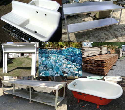
If you’ve ever spent hours searching for the perfect period tub/doorknob/window to replace the rotted/missing piece for the home you’re lovingly restoring bit by bit, here’s a site you might want to add to your list. There’s a myriad of items, and unlike some sites, it’s actually easy to look through most of their inventory. They also have a bunch of odds and ends that would make for interesting furniture pieces and home accessories (if you’re the eclectic-collector type).

Shown left to right, top to bottom:
Farm Sink (Wolff Mfg. Co), $475.00,
Buy it here.
Commercial Stainless Steel prep table, $675.00, Buy it here.
Vintage Oak Mantel, $675.00, Buy it here.
Reclaimed Glass, call for price, Buy it here.
Mahogany Bleacher Boards (from a high school gym), $6.00 per square foot,
Buy it here.
Giant Industrial Workbench, call for Price,
Buy it here.
Claw Foot Tubs, $250.00-$475.00 each,
Buy it here.

search here.

MAIL DROP ALUMINUM FINISH

Constructed of 1/4” thick aluminum plate and 20 gauge steel, Salsbury recessed mounted mail drops feature a spring-loaded mail flap and an adjustable mail flap stop. Mail drops also feature a durable powder coated finish available in five (5) contemporary colors. Mail drops are ideal for collecting documents and small packages and may be used for U.S.P.S. residential door mail delivery.

Purchase Information:

Price: $89.50
Availability: Buy MAIL DROP ALUMINUM FINISH here

Roof Hatch

I stumbled upon the blog Building Green on Montrose where they’re tracking the renovation of a 100-year old rowhouse in Philadelphia. Besides being an interesting read, they’re providing some excellent links and references for materials. If you’ve ever thought about a roof hatch/deck, check out their post here.

Picture on left is taken from Building Green on Montrose (Update on the roof hatch).

Roof hatches shown on right available from Insula-Dome: Buy it here.

More information:

View Roof Hatch here

Spamghetto Wallpaper

I love this Spamghetto wallpaper!

Everyday our mailboxes are flooded with unsolicited offers of porn material, pirate software, viagra, illegal financial services and advice on women seduction: if this is annoying for the average user, we really love it. A quick glance at the spam mailbox always provides fresh inspiration: bizarre subjects guides us in the quest for the definitive answer to fundamental humans’ problems. But the crisis is striking and we must recycle. So, instead of sweeping spam under the carpet, we decided to save some junk-mail in order to turn it into a wallpaper for your house before it’s too late: someday a brilliant scientist will find the definitive solution to eradicate from the web the bittersweet pleasure of spam. Spamghetto is not like your grandma’s wallpaper. If you provide us with your room’s dimensions, we can, with our generative software, produce a design wrapping and folding around shapes and objects on your wall’s surface.

More information:

View Spamghetto Wallpaper here

Source: Via

PurePro USA Corp Faucet Page 04

I’m not proud to admit it, but I’m a confirmed water-snob. I can tell the difference between spring, reverse osmosis (RO) , and tap water even by just smelling it. I can’t help it, but it’s hard for me to drink regular tap water, or even spring water for that matter. I get this talent/affliction from my mother, which means that even since I was a child, I’ve had two faucets at the kitchen sink: one for regular tap water, and one for Reverse Osmosis water. I’m currently working on remodeling my kitchen in Los Angeles (pictures to follow when it’s done, I promise) and I started to research my options for which faucet to get for my RO filter. There are usually some pretty good options available and it’s not too difficult to match an RO faucet with some of the more modern kitchen sink faucets out there. For instance, faucet 101 is a pretty good match for the Ikea Ringskar. But today while looking for a new RO filter faucet, I discovered something I’d never seen before: the 3 function faucet (faucet 208), which includes hot, cold and RO water all in one faucet. Something like this would really simplify the counter top area but still include the great function of fresh water right at the sink.

If you share my delicate palate, I really recommend that you get a home water filtration unit because it will save money and remove your need for bottled water. I completely recommend the nicest folks in the business, Pure Water Products — they’ve been doing this for over 20 years now.