skip to main content


RENOVATE

Polumbo’s Peck Slip loft

So, originally I had planned to post pictures showing Randy Polumbo’s Mojave Desert house, but those photos are hard to get, so you’ll just have to settle for a glimpse of his loft in New York. The way Polumbo has repurposed items is pretty inspiring, and it might just renew your faith in eBay and salvage yards.

Here are a few examples that stand out: the stove was found on eBay for $80, the wood-burning hearth is made out of abandoned lockers, the antique cast-iron and sewage-pipe balustrade pictured on the lower right might have once been in a church (to which Polumbo said, “I have a soft spot for ecclesiastical garbage.”), and the dining table is made from an antique workbench surface.

All in all, if any of it strikes a chord with you, you’ll have to check out the article to see more.

pics & info via New York Magazine’s Trash to Treasure article.
Also, check out his Mojave Desert house too. It’s fun.

Source: Via

Summerhouse Skåne

Sometimes it’s easy to forget how much paint can change an interior. This renovated farmhouse gets a jolt of bright turquoise to highlight the stairs, bookcase, and door jamb. Also, check out the site for the bright yellowish orange wall/room, which is surprisingly lovely.

LASC Studio

[via remodelista via materialicious]

Mark Giglio Wallpapers

With so many great wallpaper options, it’s hard to pick just one.

design:
Mark Giglio, 2009

“Hand Print” Wallpaper (2 Rolls) $240.00,
Buy it here.
“Kabegami” Wallpaper (2 Rolls) $240.00, Buy it here.

tham and videgard hansson arkitekts

Whoa, check out this apartment with its crazy color-transitional parquet floors. Not sure how much I’d like to live there with that much color all the time, but it’s certainly nice to look at. Visit designboom for bigger/more pics.

they used patterns and colour to order space in previous projects that the occupants had seen.
the overlapping colours transform the layout of the apartment and add a new structure of spaces
linked to each other across the original plan. the parquet floor also function as a uniting system
that offer design possibilities. once they had set up colours in different shades, they developed
each room in relation to the others, every piece of parquet was defined to fit into the right postion,
there was no random factor in the construction process. -designboom

[via designboom]

[posted by katie]

Ting’s Leather Belt Floor Tiles

I remember posting Ting Studio’s Belt Floor Mat back in June of 2007 and it blew me away. But this, this is really spectacular. You can have a whole floor of recycled leather belts. There’s not a whole lot of info on the site (that I could find), but Met Home’s May issue (pg 74) lists the floor tiles at $75 per square foot. It’s expensive, but man, it might just be worth it.

Apartment Therapy has a little more info about the floor tiles too if you’re interested.

$75/sq ft., Buy it here.

(Also, I wonder how easy it would be to replicate this yourself? You’d have to do some hunting at resale shops for the belts, but as far as adhesive I just don’t know…)

Purchase Information:

Price: $75
Availability: Buy Ting’s Leather Belt Floor Tiles here

Upgrade Shower

This shower is super sleek (even the pan’s drain is streamlined), but I guess it better look that way for a total price of $2800.00.

Purchase Information:

Price: $2800
Availability: Buy Upgrade Shower here

Dollahite House

If you’re into the real estate market in Austin, you might be interested to know the Dollahite house is on the market. Featured in Dwell a while back, it’s an excellent example of how a teardown house can be salvaged back to life with impressive results. (Particularly interesting to me is the simple modern landscaping (as shown top right)…mostly how it’s been added to/matured since the first photo was taken.)

To see the listing, go here.

To see Blake Dollahite’s work and the house in detail, go here.
[via materialicious]

Pendulum Door Knocker

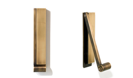
Yes, this is more expensive than any door knocker you’ll find at your local hardware store. It’s also an exponentially nicer design and is sure to dress up your entrance a bajillion times more than the others available.

This bronze door knocker brings old world craftsmanship and unadorned utility together to create a minimalist sculpture. The hefty weight of the handle feels good in your hand, and has slightly recessed sides to intuitively grasp. The bronze is a living finish patina, which will naturally wear and color according to use and environment.

1.50″l x 2.00″w x 10.00″h

$275.00, Buy it here.

Purchase Information:

Price: $275.00
Availability: Buy Pendulum Door Knocker here

Faux Wood Beams

I think I remember originally seeing this subject in Domino (so sad to see it fold), and just recently remembered the idea when staring up at my oh-so-not-spectacular living room ceiling. It seems like a great way to add some character and interest to a room without going full out crazy on construction costs.

They’ve got a good variety of instructions to help you through installation, which, of course, I’d recommend taking a look at before you buy.

Price varies according to size and wood type. Buy it here.

More information:

View Faux Wood Beams here

Liquid Sink – Black

Somehow I missed the fact that DWR had expanded its bath collection to sinks and tubs. Some of the prices seem a little steep, but the looks are top notch.

Living up to its name, the smooth interior of the Liquid Sink is interrupted by only a single groove that allows the water to slip through. The drain, which is hidden by a resin panel, is accessible by lifting the panel, whether for cleaning or to add a stopper if you want to fill the sink with water. The barely visible p-trap (the under-sink drainpipe) furthers the clean aesthetic. An adapter kit comes with this European-style sink to make it compatible with U.S. plumbing. The Liquid Collection is designed by Nuria Coll, who is part of a Barcelona-based team that works solely on items for the bath.

H 19.7″ W 23.6″ D 19.7″

$2,040.00, Buy it at DWR.

Purchase Information:

No longer available.

Loft, Renwick Street, New York

You know, renovating is no big deal. For example, if you need more space, why not just combine two whole floors of a building? It probably doesn’t take a lot of time or money…right?

All kidding aside, the gigantic windows are pretty amazing, and I like the choice of keeping the materials relatively simple and spare so that the space remains visually open and airy. The concrete floors give a nice history and sheen, although I’m starting to wonder about the heating bills in a place this size…with those windows…though I guess if you can afford to have a place like this, heating bills aren’t such a worry.

Two adjacent floors of a former factory were joined by removing a quadrant of the floor area between them, creating a double-height space that links all parts of the loft. A large, new opening in the exterior wall replaced two rows of existing windows. Industrial steel sashes were used to break down the scale of the opening and to reference neighboring natural-light factories. Public areas on the lower level utilize a concrete floor—a nod to the building’s past— while wide-board oak was used for the stairs and upstairs bedrooms. The building’s rough textured columns and beams became a counterpoint to the smooth surfaces of the new walls.

[via LoftLife Magazine]

to see more: fernlund + logan architects

Trove Wallpaper

There’s certainly no shortage of lovely wallpapers these days, and Trove’s collection goes in the ‘gorgeous’ category.

Type I commercial grade paper. UV resistant inks. Non-toxic wax-based protective coating. Repeat width 33.5″ or 67″ depending on pattern. Estimates based on provided wall dimensions.

Call or email for estimate: Buy it here.

More information:

View Trove Wallpaper here

Private Residence by Odos Architects

Wow. Look at how this home’s outside wall curves alongside the street perfectly…and how the wooden entrance provides such a nice warm contrast against the dark facade with only one large window at the edge facing the street. Lovely.

Project Info:
The design and aesthetic of this private residence is a reflection of both it’s semi-industrial context and the particular geometry of the site. The two-storey element of the building was partially sunk below ground level, with the resulting change in level being utilised in section to create complex relationships between the living volumes and external spaces.

[via materialicious]

to see more: ODOS architects

Minakani Wallpaper

Whoa, check out Minakani’s off the beaten path wallpaper collection. They’ve got some really eye-catching designs that’s sure to spice up any boring walls you might have.

Email Minakani with your dimensions and address and they’ll email you a quote with the price and shipping time. Buy it here.

[via Designage]

More information:

View Minakani Wallpaper here

Fold away tables

This apartment located in New York has a smart solution for keeping clutter at bay: both tables shown above fold away into the walls, clearing up floor space. Especially interesting is the use of color…I love that when the tables are being used, bright swatches of color show, yet when folded away, the space remains pure and white.

See it here.

[via NYTimes]