skip to main content


RENOVATE

Ecolect Sustainable Materials Resource

Ecolect is an online resource of building materials for designers, re-modelers, builders, or anyone interested in using sustainable products. Each material has an overall summary as well as how it’s made, how it’s used, and where to buy it. Keep this one bookmarked for your next project.

Vivienne Westwood Wallpaper

Fashion designer extraordinaire Vivienne Westwood is known for her punk and rock-influenced clothing (she has ties to the Sex Pistols, helped Sandra Bullock look like a million bucks, and was the designer of choice when Sex and the City’s Carrie almost married Big), but she also has a fancy line of wallpaper with Cole & Son. The collection features eye openers like an almost nine-foot-long Union Jack as well as prints inspired by some of her most iconic fashion collections, including 1981’s Pirate collection and 2007’s I am Expensiv collection (wallpaper seen above, second from the left).

(more…)

OWI: American Outfitters

These two photos of a 70’s villa are uber-minimal/sparse, but the other shots show a quirky side. Refurbished by interior architects Renaud De Poorter and Femke Holdrinet, the home still has the bones of the original build, but the updates make it feel thoroughly modern and livable. It’s quite the showpiece.

Photography: Verne

(more…)

Source: OWI

Inspiration: Ranjana and Naeem Khan’s Soho loft

There’s quite a few fetching things about this living area in Ranjana and Naeem Khan’s Soho loft, the least of which is the (still) lovely Pouf Capitonne that we’ve featured before. Considering the super-wide/super-low green sofa and the many modern classics (see below), it’s sort of surprising to see the peach/rose undertones in the curtains and carpet. Talk about a color that most of us wouldn’t think of, peach is it. Just goes to prove that sometimes unlikely color combinations work well, so widen your color horizons the next time you’re considering updating a room.

Product links and more photos to follow.
(more…)

Inspiration: Orange Office area

This isn’t the best quality picture, but it does serve to remind us that orange can be good… sometimes. Also, it’s worth noting that this under-the-stairs desk manages to pack a lot of work surface into an otherwise underused area.

Inspiration: Stair Materials

I’ve had these two images in my inspiration folder for a while now. The mirrored stairs shown on the left is from photographer Polly Wrenford’s portfolio, but I didn’t have much luck with referencing the one on the right. If you have info, please let me know.

Feld’s Kitchen

Well, this sort of idea for kitchen storage would certainly motivate you to keep your shelves tidy. The balance of industrial and natural materials (wood, marble, etc.) makes for a pleasing picture, I’m just wondering about those sliding panels. Would they get in the way, or just act as strategic screening for the untidy areas?

See Dwell for complete slideshow.

More information:

View Feld’s Kitchen here

Source: Dwell

Cottier/Barber Home

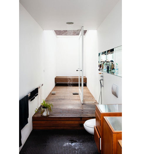
Take a look at this gem of a bathroom. The wood floor of the shower extends into the outside patio, and with that huge pivoting door, the indoor/outdoor divide is blurred nicely.

(Here’s a previous post on pivoting doors, with these two resources listed for hinges:
ePivots and Rixson)

More information:

View Cottier/Barber Home here

Source: The Selby

Pieces Wallpaper

This wallpaper is sort of a subtle crazy pattern… from far off it’s subtle, but up close it’s all nicely weird. Just what you need for an entryway or powder room.

designed in Brooklyn by Julia Rothman
Double roll measures 27″ X 30′.

Purchase Information:

Price: $105.00
Available from: Rare Device

Inspiration- Stairs with Glass Banister

Hmm… concrete plus glass usually means cold (not brrr-cold, more like cold-museum-looking), but this stairway/entrance (garage?) has been in my inspiration files for a while. Knocking down a regular banister in favor of a glass one *wall* like this would sure let a lot more light bounce around, not to mention pare down any visual clutter. Of course, the artwork, bike, and chair helps this space to feel lived in… it might veer towards the uncomfortable-museum-look without them.

Image from Aun and Su-Lyn’s home on Design*Sponge.

*Thanks Joe

Source: AT

HOUSE MILCAMPS

Yes, these two photos are of the same house. Does that blow your mind, because it sure did mine. If you want your head to properly and majestically explode, take a look at the following photos. Freaking A-maz-ing.

All photos, Tim Van De Velde.

(more…)

More information:

View HOUSE MILCAMPS here

Source: OWI

Yellow!

Most of us aren’t really fans of yellow, are we? I know I’m not, but this image of bright yellow doors has been in my inspiration files as a reminder of the possibility of maybe painting something yellow. Can you imagine? It would be a jolt, wouldn’t it… like somebody hitting you over the head with a baseball bat (a nice, sunshiny one) every time you walk past it.

Didn’t look long enough to see if I could find other pics of the same interior, so if you find some, please let me know.

More information:

View Yellow! here

Source: ELLE Interior

Anita Calero’s Loft

I’ve been seeing some of these shots around on other blogs and it reminded me of the story I initially saw on LoftLife. Often I veer towards a minimal aesthetic, where I’ll pack away all the knicknacks and thingamajigs I’ve acquired over the years, only to run across photos like these which remind me of how nice a home is when it tells a story. I mean that in a ‘collect-stuff-that-you-love’ sort of way, not in an ‘I-hired-a-designer’ sort of way, does that make sense? I think sometimes it’s hard to tell in interiors magazines which way that pendulum swings, but in the case of Anita Calero’s loft, it just seems obvious that it’s all her. Her stuff, her likes, her collections. (Watch someone tell me she hired a designer.)

That’s enough of my rambling. Click ‘Read More’ for more photos (and a little more rambling).

(more…)

Stencil 101 Decor

With all the fancy (i.e. expensive) wallpapers available nowadays, it’s hard to be constrained by a budget. If you can’t quite afford your wallpaper of choice, an alternative to consider is stenciling. While this might bring to mind unfortunate images of hearts and flowers and ducks, forget about all that. Graphic designer Ed Roth’s stencils are simple patterns that will change up a wall with a few easy steps, and if that sounds scary, no worries, there’s a how to video that’ll ease your beginner fears.

-portfolio of reusable stencils, project instructions, and photographs

10 die-cut recyclable plastic stencils
11 x 11-5/8 inches

Purchase Information:

Price: $24.95
Availability: Buy Stencil 101 Decor here

Inspiration: Kitchen cabinets

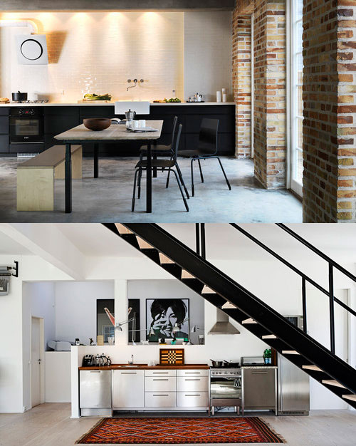
These two kitchens (shot by Stuart McIntyre) are entirely tempting to put into my future kitchen renovation file. However, the lack of upper cabinets seems sort of… scary. I know it’s quite a popular option, as it opens up the room and allows display of dinner and glass ware, but losing all that storage space seems risky. I love the way it looks, but I’ll have to think of alternate storage options if I go that route, as I have very little lower cabinet storage space.