skip to main content


RENOVATE

Casa no Geres

So, this house looks pretty interesting, right? Large windows, large overhang/cantilever, idealic setting, all these signs point to ‘yes’.

However, looking at this image below:
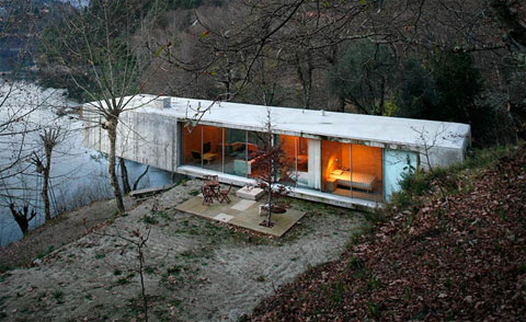
you kind of get the impression of an old mobile home perched dangerously on the edge of a hill. Some graffiti, a little trash strewn about, and the setting is the kind you hope your kids aren’t spending time around. Am I wrong? Ah, now wait, before you go getting all upset, these photos reinstate the initial opinion of excellence and grandeur: (more…)

More information:

View Casa no Geres here

Source: The Cool Hunter

Turner Pocock Cazalet Wallpaper

With a name like that who needs a PR company? These two designs from TPC (my nickname for them, btw) are just plain cute. Come on, polar bears and zebras? You just can’t go wrong.

ยฃ70.50 per roll

Purchase Information:

Price: ยฃ70.50
Availability: Buy Turner Pocock Cazalet Wallpaper here

Inspiration: Carter Smith’s Home

Running across this photo from the January 2007 issue of House & Garden (via moodboard) made me look a little more at the details within the room. I’m not one for overstyling bookcases, but something about the haphazardness of these is really appealing, because, uh, oh yeah, they don’t look styled. I might try paying a little more attention to my own study bookcases… goodness knows they need some love.

also his brick and wooden beam bathroom (via Habituallly Chic) is just not fair:
carter-smith-jan-2007-house-garden-17.jpg

Oktavilla / Elding Oscarson

Magazines as wall material! Such a great idea. Check out the rest of the project via ArchDaily.

“Besides having a literal relevance to the clientโ€™s business, the wall made of stacked bundles of magazines is not only a natural conversation piece in its mere irrationality, but also works as an acoustical absorbent.” -ArchDaily

Architect: Elding Oscarson

Inspiration: Small Tile Everywhere

Here’s a small grouping of bathroom photos with aqua/blue small tile used (almost) everywhere. I love the way it looks, but would you get tired of all that color after a while?

top left: AT: Kimberly’s Loft
top right: Scott Weston Archtecture*Design
bottom left: Scott Weston Archtecture*Design
bottom right: Beach Studios

Chambre avec Vue by Kenzo Minami

Talk about wall art, this huge mural is one heck of a commitment. You can order whatever size you want, of course, but seeing it this size sure makes an impact, doesn’t it?

With this wallpaper, you choose the custom size you want, Height x Width and the design will be scaled to that size. It will come in self adhesive strips that overlap to make a seamless, large scale mural.

Production fee: $500.00 plus $6.44/sq ft.

Purchase Information:

Price: $500.00+
Availability: Buy Chambre avec Vue by Kenzo Minami here

Fernlund & Logan Loft

Remember this wall art I posted a while ago? Well, that particular interior was bugging me, because I thought I saw it somewhere before. And BAM! Today I saw it over on LoftLife. So much freaking white space, it’s almost not fair. If I lived there, those glossy grey floors would be treated to my rollerskates all the time.

Inspiration: Black Glossy Floors

More proof that black isn’t going anywhere. I wish I would stop finding pictures of glorious black shiny floors, because it makes me itch to paint my own hardwood floors (that have absolutely nothing wrong with them).

[via BOLIG Magasinet]

House 43, photos Dujardin Filip

OWI is a treasure trove of homes to break my heart against, I swear. This strange one has all sorts of odd choices, but the end result is honest and comfortable. Things to pay attention to: the unassuming facade, the atrium with retractable roof (of course), the staircase through the brick wall and the small glass floor portion below (shown lower right), huge metal bookcases filled to the brim, the lack of ‘finish’ to the ceilings, and about ten other things that I won’t list. It’s like a person you meet that seems sort of boring until you discover they are absolutely fascinating.

The Schaffer Residence, 1949 by John Lautner

If you saw the dreamy film “A Single Man” by Tom Ford, you were probably wondering about the lovely house in the center of the film. If you want it, you can have it for a mere 1.5 million.

Hidden in a wooded valley at the foot of the Verdugo Mountains, the redwood, concrete & glass residence opens to the oak forest that influenced the form and orientation of the design. A meticulous restoration of systems, as well as surfaces, hardware & appliances has been completed. This published, world class architectural treasure incorporates open plan living, dining and den areas, two bedrooms, one & a half baths, laundry and attached two carport. In nature and apart, yet just 15 minutes to downtown Los Angeles.

Thanks to Matt for link!

Apartment FH, photos Vercruysse Frederik

Remember the post from a while ago, with me talking about how it was one of my favorite spaces? Well, color me happy, because I found more shots of it on OWI. That’s right, it sure is freaking awesome. You better be glad I can restrain myself, otherwise you’d get all 20 photos right here, right now.

Log House Study- Hans Liberg

Here’s an office/study on wheels that proves not all shacks have to be eyesores. Smart.

design by Piet Hein Eek, thomas mayer architecture

[via Make:]

Source: Via

Inspiration: Workspace Vignettes

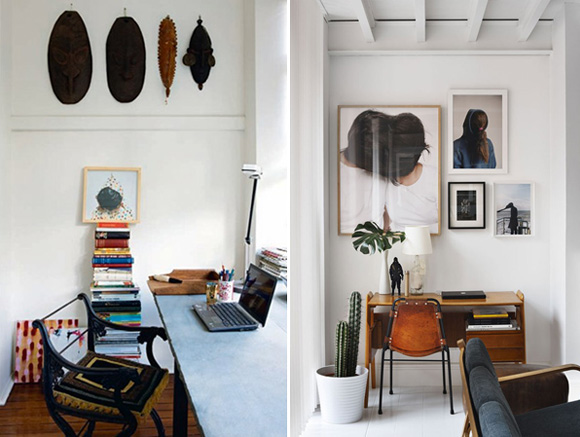
Often I’m tempted to fill my all walls with art and photos jammed all together, but these two smaller workspace shots that I ran across yesterday remind me that sometimes simple editing and a little breathing room can make much more of an impact.

On left: Nicola Finetti’s home
On right: Delfin-Postigo house

Inspiration: Bathroom (Showdown)

I’m planning on updating our bathroom once we eventually move back to the US, and so far these two photos top the list of my starting reference point. I’ve always like the penny tile (especially dark like on the left) but there’s something incredibly clean and refreshing about all white bathrooms. Hmm, which direction to go…

Inspiration: Picture Frame Collection

I love the how the art display in this room adds interest to a section of (what looks to be) a huge white wall. The low cabinet running the length of the room also helps to anchor and focus the eye as well. (Lighting fixture: Random Light)